How vital is Data?
Data has proven to be the core of SAP. How users interact with this data is what determines efficiencies or lack of. As users of SAP almost everything we touch, interact with and leverage to sell product is impacted by how effective we are at reading and interpreting this data.
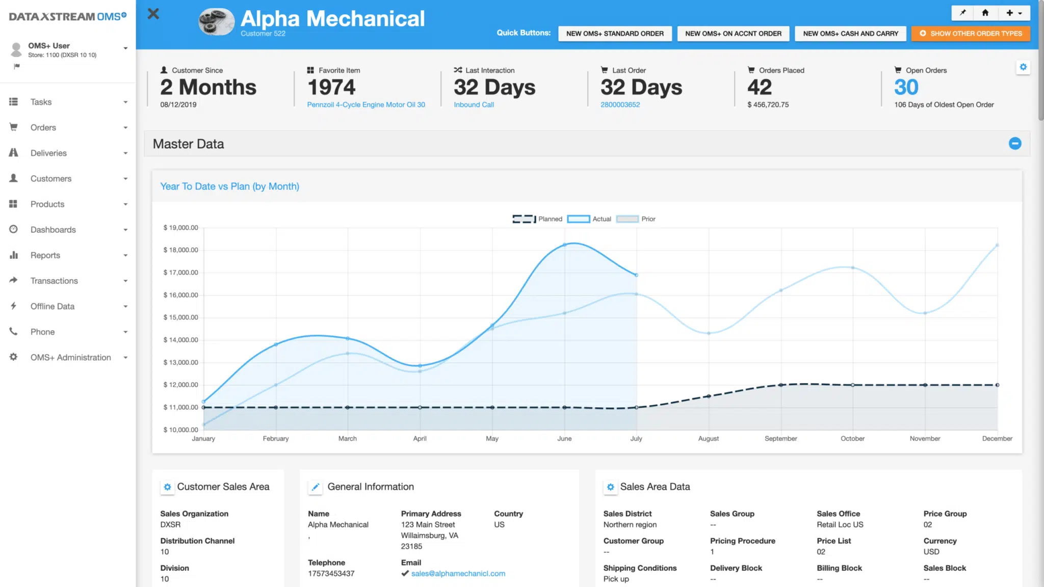
Often, we see large chunks of data dumped on a page to evaluate. The problem is, this is not always the best way of digesting the data for the end user. As an application developer my job not only entails making a user-friendly intuitive design, that the users can easily navigate, but also to increase data readability.
How to better Interpret Data
There are numerous ways of making it easy to read data and perhaps the best and most well known is the utilization of charts and graphs. Building an application such as OMS+, that creates an optimal environment for SAP users, I know that it is imperative to be able to change and interpret data in various ways. When interacting with customers CSR’s typically have very little time whether in-person or on the phone. One example of how OMS+ accomplishes this is to incorporate graphical displays of data that can be dynamically changed by the user in real time. This will ultimately allow the user to change the charts, data views on the screen quickly to accurately answer the customer’s question quickly.
This can be as simple as adding buttons that enable the user to change graphs by time period, i.e. week, to month, to year. Another button could automatically build the graph in certain modes dependent on the data it is siphoning in. Through a series of buttons, we grant the user the ability to modify the charts and graphs on their OMS+ dashboards based on their needs and understanding. This allows for easy user interaction fueled by giving the power directly to the them.
Data Visualization beyond graphs
Although charts and graphs rate high on the visual appeal scale, we realize that they are not always the best means to show data specifics. We often rely on visual indicators that are appropriately colored to show such trends such as decreases and increases in various contexts as seen below.
Even though this is simple it is extremely effective at giving the user the quick info and trends that they rely on for everyday business situations. We take it even further as to get as granular as to use this method down to the line items for orders. This creates a way to glance at an order and see any issues or errors if they exist. We know from all of our SAP expertise that making errors more prominent translates to greater effectiveness of order management and time allocation.
Custom Data Organization
Not only are we integrating various ways to utilize data but we also allow a custom configuration so the user can prioritize which charts, tables and graphs are shown where. We realize that business goals often change and adapting our software to better align with them in real time gives our customers an advantage.
The users also have the ability to change the size of these modules as well. This unique customization is just another way OMS+ takes the normal SAP behavior and creates a truly modern and effective strategy for running your order management today.
Summary
It’s obvious that we take SAP data interpretation and readability serious within OMS+ and we always research how the users are utilizing this data. After the results of this research any pain points discovered can be removed so that your business can thrive on our platform like you have never seen before. We keep up to date on the data visualization technologies and always are making sure what we are using is the latest and greatest to give you and your business an edge.
To learn more about DataXsteam’s OMS+ Order Management System for SAP please see https://www.dataxstream.com/sap-solutions/sap-point-of-sale-solution/
Or find it in the SAP App Center https://www.sapappcenter.com/apps/6561#!overview


